


Ah, yes, it’s that wonderful time where we talk about ugly book covers. You might’ve heard that popular saying, “Don’t judge a book by its cover,” but, as bookworms, we know that is a total lie. We judge books by their covers, sometimes even buy books based off their covers, and will complain if they look in the least bit ugly. And we all know the Curse of the Ugly Cover, and, usually, they can be categorized in five groups.
I know that I usually post reviews on these days, but I was too lazy to write up a review over the weekend, and I had this post that wasn’t really scheduled for a date or anything, so I thought, “Why not go ahead and post it?” So, here’s me breaking my sacred schedule.
Also, I’m using the Slideshow format, so, hopefully, this won’t look like trash. Fingers crossed!
![]()
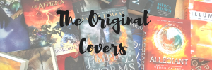
Ah yes, the original covers of books a.k.a. Publishers Were Really Obsessed With Faces and Cover Models. You might be surprised to know that John Green has gone through a crap-ton of cover changes concerning his first three books, but he has, and BOY, are they disappointing. No wonder nobody picked up his books until The Fault in Our Stars was published.
(Just kidding; I love you John Green.)
Then, of course, we have 2012, which you might remember as the Year We Thought The World Was Going To End, but was really the Year Cover Design Artists Didn’t Even Try. I mean, seriously, what is up with these badass ladies posing like they’re about to take their prom pictures? Why would anyone want to pick up these books?
Fortunately, they have gone through vigorous cover changes, and we have now reached peak level of gorgeousness, as seen in the slideshow below. Make sure you don’t become blinded by the beauty!
“I absolutely LOVE these books covers,” you say as you read your favorite book series.
“Oh, really?” the publishers respond as they contact a new cover designer to EFF UP THE BEAUTIFUL COVERS.
Seriously, what is this mess? Why are you changing the beauty of the original covers? Who do you think you’re appealing to? AT LEAST DO A SURVEY BEFORE YOU JUST LAUNCH NEW UGLY COVERS MY WAY! WHY IS IT SO HARD TO ASK FOR OPINIONS?
But, seriously. I find it highly concerning that publishers just change the book covers without even taking some sort of consumer report, since bookworms are easily reachable and we are literally the ones buying the books. Covers mean a lot, and I know publishers are well aware of that since they change covers all the time, so why do they change the covers of books that are selling well, and close to series’ completion? Why do they make the gorgeous cover out of print? Why do they change the books mid-series so I’m forced to re-purchase the previous ones in the series? WHY?
A moment of silence for the beautiful old covers that died for the ugly new ones. I highly recommend listening to this song by Lindsey Stirling to set the mood.

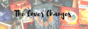
Okay, for some reason, publishers went through this awful phase where they assumed bookworms liked seeing blown up faces on covers. Newsflash: we don’t, and we never have. There’s just something about seeing a close-up of a face that’s just a complete turn-off for readers, and, thankfully, the trend seems to have died over the years, but R.I.P. all the books that could have had beautiful covers if they were published recently.
Also, three of these covers went through changes, and, unfortunately, Vampire Academy suffers yet again. All Richelle Mead wants is a beautiful cover! Why does she have to suffer like John Green used to?

Sometimes, the U.K. can definitely beat us at gorgeous covers that I lust for, but sometimes, they just fall flat. Have I already expressed my distaste for the U.K. editions of all of V.E. Schwab’s books? Because they are so god-awful compared to the beauty of the U.S. editions that I almost feel bad. The covers look so busy and boring and less minimalist than the U.S. covers. Not to mention how bland the ACOTAR trilogy looks. WHY DOES THAT AWFUL SHADE OF GREEN EXIST? WHY DOES THE ACOMAF BACKGROUND LOOK SO BORING?

Of course, besides fangirls and bookworms alike being robbed by horrible book-to-movie adaptations, we are also greatly rewarded with ugly movie tie-in covers with stickers that ruin the book and are almost impossible to remove!

(Somebody please help us.)
![]()
And that’s it for my rant on ugly covers! I hope any of you guys found that slightly interesting or funny (I’m neither in real life). I’m absolutely loving these Let’s Chats, and this is my first time using the Slideshow format, so I hoped you like it. I thought it was the best post to use it for since the pictures sizes were all over the damn place.

Do you agree with my least favorite covers? Are there any that I missed out?


I have to disagree with you on the faces on covers. I don’t mind them as long as they don’t look tacky like the ones you showed did. I find YA books to have much more tacky book covers a lot of the time, although some crime novels covers are terrible too! I think if a face on a cover is tactful, then it can look really nice. EG, Witch Child and Memoirs of a Geisha.
LikeLiked by 2 people
I haven’t seen many “faces on book covers” for adult releases, so that’s really interesting! I usually see cover trends on YA, and rarely in the adult genre (and I don’t really care how adult covers look as much as YA, for some reason). Maybe it’s because adult books are so weird that the cover usually doesn’t make sense unless you read the book. 😂
LikeLiked by 1 person
Haha that’s true! Adult book covers could be anything under the sun and you’d probably not know what the book was about from looking at it. Example, I recently bought a thriller / crime novel from the 70’s and the cover is of a Quality Street chocolate… bleeding… VERY weird! 😛
LikeLiked by 1 person
Your rage in this made me laugh but it’s totally true! I hate movie covers because I always have to check with a clerk juuust in case the book itself is some weird movie edition *_*
LikeLiked by 1 person
Oh, thank you, I’m glad you found me funny! 😄 Haha, same. It’s always the movie posters, and the movie posters don’t look that good in the first place, so it’s annoying to see them on the cover of the book. 😩
LikeLiked by 1 person
I actually don’t mind the UK editions of both the ACOTAR series and Shades Of Magic trilogy, though I wish the latter had a white background and maybe a design that was a bit smaller. But I feel like they go very nicely with This Savage Song and Our Dark Duet!
I had no idea John Green went through so many cover changes? I mean, I’ve seen quite a few covers for Looking For Alaska but never the ones you included! And I think the ones I have seen were like special collectors editions or something.
The worst thing to do to a reader is hands down change the cover mid-series.. what’s the point in that? Though I have to say, I actually like the new cover for The Diviners!
LikeLiked by 1 person
Yep, U.K. covers seem to always be a based off of preference. And maybe the fact that I see the U.S. covers so much, and I love them so much, and the U.K. covers are just meh compared to those in my mind. 😂
Yes, he has! Looking for Alaska was published way back in 2005. Isn’t that nuts? 😅 I don’t know when Paper Towns and Abundance of Katherines were published, though, but it was probably close to that time because TFIOS came out in 2012, and that’s his latest.
I’m so-so on the new Diviners covers! I wrote this post before they were announced and forgot to include the new new ones. I haven’t bought the books yet (I loved The Diviners), so as long as they don’t change the covers again, I’ll probably be okay with it.
LikeLiked by 1 person
2005??? Oh my god! I was still 16 at the time and didn’t know anything! To think that book has been out so long is NUTS! But also with TFiOS! Has it really been 5 years already??
LikeLiked by 1 person
I know right??? Everyone’s been celebrating the tenth anniversary of City of Bones, and I can’t believe it’s been around for so many years. 🙈 I was 7 when it was published. And yes, right??? I can’t believe it’s been 5 years since he published a book! Same with Gillian Flynn, except she wrote a short story, but still. I miss them both. 😭
LikeLiked by 1 person
Oh yeah, I saw all those posts today and I was like ‘It’s been around so long???’ especially since I only found out about it during 2012 I think!
LikeLiked by 1 person
I didn’t read the books until 2013, I think, when I was in the seventh grade! It’s feels like it’s been such a long time since I’ve joined the fandom. 😂
LikeLiked by 1 person
Maybe the expression “don’t judge a book by it’s cover” is a popular saying but it’s not something I tend to follow. The main reason I pick up books is because of the cover sometimes!
I don’t actually mind the UK version of the Shades of Magic series. I do prefer the US covers and actually brought them in hardback just so I could own them, but at the same time I like the UK covers as well.
Oh I HATE it when series covers are changed, especially halfway through a series because then my collection just doesn’t match on my bookshelves and nothing makes me more annoyed than that. It’s been done with The Bone Season series and I actually prefer the old covers to the new ones.
It’s the same with movie tie-in covers, on one hand I can see why they’re released but on the other I’m not really a fan.
Great post Mikaela, I definitely get why this turned into a rant, I feel my comment could have easily gone the same way! Also I really like the slideshow format you used for this post as well! 🙂
LikeLiked by 1 person
Lol, I don’t know how much I judge a book by its cover. I mean, I’m attracted to them, but I don’t think I’ve ever put a book on my TBR or bought it solely because of the cover. I do notice ugly book covers though. 😂
I don’t know; I think it’s the clashing colors and the silhouettes that I really don’t like. And then the U.S. covers are so gorgeous! I think minimalism is more my thing, and the U.K. covers are more busy, I guess?
That’s never happened to me! I guess that’s a good thing about not being able to buy ALL THE BOOKS. 😂 Like, The Diviners series by Libby Bray has gone through THREE cover changes, and even though I’m annoyed, I haven’t bought them, so it’s one of those “meh” things.
I can see they’re released mostly because of publicity reasons, so people know it’s becoming a movie, but they never look good. 😩
Haha, thank you so much! And, yeah, I’m glad it looks good! The formatting for all the pictures was all over the place, so I went for the Slideshow format, and I’m glad it worked out.
LikeLiked by 1 person
Oh most of the books on my to-read list have been put there because of the cover. It’s how I find most of the books I read that aren’t author inspired; how pretty the cover is.
Yeah I can see what you mean. I always preferred the US covers (why I ended up buying them alongside the UK ones) but I learnt to like the UK ones as well.
In that case I’d say you’re very lucky. I have more than a few series where the covers don’t match but by this point I just don’t have the money to buy them all over again just so the covers match.
Nah never really looks good, but I guess it promotes the book and brings more fans in so there’s that to consider as well. 🙂
LikeLiked by 1 person
haha THE FACES and movie tie-ins. I HATE those >.< Also, I thought I was alone in thinking ACOMAF + co's covers were kind of….ugly….I'm not a fan of them at all. They're just cartoon faces that aren't even realistic with boring backgrounds? idk. I hate them haha
Molly @ Molly’s Book Nook
LikeLiked by 1 person
I have never bought a movie tie-in cover ever, and I probably never will. 😂 I do like the ACOTAR US covers, but not so much the U.K. ones. I guess it all depends on personal preference! 😂
LikeLike
I definitely agree with what you said! Ugly covers are the worst, and we bookworms judge books by their covers more than anyone else. And haha, my friend was reading Paper Towns with the old cover and I was like, “What happened to the other cover???” XD
LikeLiked by 1 person
Also, WHAT THE HECK DID THEY DO TO DELIRIUMU??? THE BLUE COVER LOOKS SOOOO MUCH BETTER THAN THE ONE WITH THAT RANDOM LADY!!!
LikeLiked by 1 person
Yes, they came out with all new covers for the series last year! Isn’t it absolutely stunning! 😍 The books are so old; Lauren Oliver’s books have faces on every single one of her YA books, I think.
LikeLiked by 1 person
THEY AAAAAAARE (stunning)!!! I read Replica, a new-ish YA book from her, and that had a butterfly. 😉
LikeLiked by 1 person
Ooh, yes, true! I guess because it’s 2016, and we’ve moved on from faces? 😂 All her YA books before that have some variation of “girl on cover,” which is surprisingly consistent. 😂
LikeLiked by 1 person
Yeah, probably? XD And yup, Delirium, Panic, Vanishing Girls, BIF… XD
LikeLiked by 1 person
I knoooow; ugly covers totally suck! I really wonder if there are any stats out there about what makes someone purchase a book; it’d be a really interesting experiment. I know, right; I never knew John Green went through so many cover changes! His books are pretty old though, so I guess it makes sense?
LikeLiked by 1 person
XD That WOULD be an interesting experiment! And yeah, it does. But at least the cover changes made them BETTER. XD
LikeLiked by 1 person
Ugly covers suck, but nothing hurts more than when a publisher changes the covers mid-series. Beth Revis’ Across the Universe trilogy comes to mind – the first two were so cool and space-themed! And then the third one broke the mould and was all foresty and green…ruined me.
Occasionally cover changes work though. The Shatter Me trilogy is one I re-purchased for the new covers because, hello! GORGEOUS.
In case you haven’t picked up on it yet, I have problems.
LikeLiked by 1 person
Yes, I saw those covers! That sons of the cases where both of the covers just aren’t that good-looking; I feel the same way about the Vampire Academy books, because both the originals and the re-design are just meh.
Yes, the Shatter Me covers are so pretty! 😍 I’m glad they caught Throne of Glass early. The covers for those are stunning, and I’d hate to have that cover model on every single book. 🙈
LikeLike
Wow I never knew John Green’s first books had covers like that! I always think his covers are gorgeous, so I’m surprised to know some of his first ones were lacking. Also, I HATE movie tie in covers (with the exception of the Harry Potter ones), usually they look so cheesy and staged and don’t really capture the true essence of the book.
LikeLiked by 1 person
Lol, yes, his books are actually hella old, so it makes sense that his covers weren’t that great at the beginning. Now that he’s more mainstream, I can see why they made his covers much better now. 😂 Wait, HP doesn’t have movie tie-in covers! They have cover changes, but they’re not really there to promote the movies. But he’s, they do look fake! It’s mainly because movie posters look fake, so it looks ten times worse on a book. 😂
LikeLiked by 1 person
HP covers aren’t super movie tie-in-y, but in the later ones they drew Harry to look a lot like Daniel Radcliffe haha but I’m okay with it because that’s how I pictured him anyway when I started reading. And you’re right, movie covers look so fake that it just looks awful on a book!
LikeLiked by 1 person
Really??? That’s actually so interesting; I never knew that! Now this makes me want to go look at the covers and see if Harry looks like Daniel Radcliffe in any way. 😂
LikeLiked by 1 person
Hahaha what a fun post Mikaela! 😀 I don’t like the cover with faces either, and it was a bummer that girl on cover is so popular hahaha it’s just disturbing and sometimes the models don’t look like the characters on my imagination hahaha also I hate cover change! I don’t like The Winner’s Cruse new cover because the original was so, so pretty with all the beautiful dresses and the model who actually looks like the Kestrel I imagine hahaha 😛 I prefer US edition as well but I actually love Schwab’s UK covers. US ADSOM is so much better, I agree, but if you put it aside and just look at the UK covers, well I think it fits the story hahaha I prefer the UK Vicious though ahaha 😉
LikeLiked by 1 person
Haha, I’m glad you found it a fun post! ❤ Yeah, same, I don’t know what was going on with that??? Like, not even Twilight had faces on the covers, so it interests where that started from. 😂 Mm, yes, the Winner’s trilogy covers are SO BAD. They’re anti-Kestrel in so many ways; and I hate it. It’s trying way too hard to look like the TOG covers, and I don’t like it. And, yes, I actually pictured her like the cover model as well! Ooh, I don’t remember what the Vicious UK looks like; I’m going to have to look at that one. I find the US one interesting since it’s a scene from the story!
LikeLike
I love this post, Mikaela!! 😊 And I completely agree with you on so many points. One of my biggest bookish pet peeves is when they change the covers in the middle of the series (unless the covers need a change). They did this for The Bone Season and while I don’t mind the new covers the old ones were so much better! It’s like what’s the point of changing a gorgeous cover to something else? And in that case they ended up doing the original covers for special editions each release because so many people weren’t happy lol. Also, I agree with you about the UK editions of ACOTAR. They seem bland when compared to the US ones. I think it’s because the US ones use bolder colors and black lines, they just stick out more.
LikeLiked by 1 person
Thank you so much, Melissa! 😁 Haha, yes, I’ve seen the cover changes for the Bone Season, and I feel like it’s such a waste. Hopefully, they don’t change them again because it’s supposed to be a pretty long series. I’d be annoyed if they just changed the Throne of Glass covers out of nowhere. And, yes, the U.K. editions look so bland! It really bothers me.
LikeLiked by 1 person
You’re welcome!! Definitely a waste and I don’t see them changing the covers again only because of everyone’s reaction to it. 😂
LikeLiked by 1 person
Ahahaha! I don’t think I’d ever seen the original John Green covers — you’re right, they are BAD. The revised ones are SOOOooooo much better!
LikeLiked by 1 person
I know, right; they’re actually buried so well. 😂 I didn’t even know there were different covers until a couple of years ago! I’m glad he got a better cover design for all of them, though!
LikeLike
Bwhahha some of these are just.. sad and wrong. And seriously, poor Richelle Mead cannot catch a break with those covers. Yikes, just one bad one after the next! The cover change for The Winner’s Curse is quite possibly the saddest one ever. Especially because ALL those cover changes (other than Unwind) were just trying to copy ToG which is annoying. I don’t WANT every book to look like ToG! Also, I laughed at your prom picture comparison because SO. TRUE!
LikeLiked by 1 person
I know, right??? I really want her to have a stunning cover, but it’s like the cover gods don’t allow it! 😂 Yeah, it really annoyed me that the new Winner’s trilogy covers were trying so hard to look like the TOG ones! Like, I love Aelin and I love Kestrel, but for totally different reasons. And thank you, I’m glad you find me funny! 😄
LikeLike
This was such an amazing post!! XD I totally agree, especially with the sudden changes in the book cover while it’s still going on. They are sooo frustrating.
LikeLiked by 1 person
Thank you so much! And yes, mid-cover changed just need to stop. At least wait until the series is finished so I can have the better covers! 😂
LikeLiked by 1 person
Exactly!
LikeLiked by 1 person
Great post! I did one about book covers a while ago too! https://bookdrblog.wordpress.com/2017/05/09/what-do-you-look-for-in-a-book-cover/
LikeLiked by 1 person
Thank you! 😄
LikeLike
I never ever have bought a book because of the cover. It’s the synopsis that makes my decision. I am tired of seeing men’s six packs and bloody butcher knives all over covers too. It’s like an epidemic now. I can’t believe either how many of the same models are on covers.
LikeLike